
Logo Design & Brand Identity
First impressions are designed.
Your logo is often the first thing people see. We craft distinctive brand marks that communicate trust, personality, and professionalism — with multiple concepts, revisions, and all file formats you need.
3–5 concepts to choose from · Unlimited-feeling revisions · Every file format you'll ever need
KabadCart
Scrap pickup, branded like a startup
Facts at a glance
Short, citable answers — price, timeline, location, and contact.
| Starting price | Logo projects start at ₹15,000 INR (typical range ₹15,000–₹50,000). Pricing details |
|---|---|
| Typical timeline | Typical timeline is 1–3 weeks from brief to final mark and basic brand kit under standard scope. how we ship |
| Team location | In-house team at 2nd Floor, Bhamashah Techno Hub, Malviya Nagar, Jaipur, Rajasthan 302017, India. Google Maps |
| Best-fit projects | Best for new brands and rebrands that need a distinctive, multi-size-ready logo system. Case studies |
| Included support | Projects include post-launch support for the window stated in the scoped package (typically 2–3 months on website builds), then optional ongoing maintenance. Maintenance |
| Technologies | Vector artwork delivered for print and digital use from Figma/Illustrator workflows. |
| Contact | Aucio Infotech — +91 81076 27005, info@aucioinfotech.com. Hours: Mon–Sun, 9:00 AM – 8:00 PM IST. Contact page |
| Last reviewed | Editorial facts last reviewed on 4 Aug 2026. |
Last reviewed: 4 Aug 2026
Why It Matters
Your logo clocks in before you do
0.00s
to make a first impression
Visitors judge your business in the blink of an eye — your mark does the talking before a single word is read.
0%
recognise a brand by its logo first
Before names, taglines or ads — the symbol is what memory grabs. A weak mark is a brand with amnesia.
0+
surfaces your logo must survive
Favicon, invoice, signage, app icon, packaging, watermark — one mark has to stay sharp on every one of them.
Selected Work
Marks with a story behind them
Every logo here started as a business problem. Hover the marks, read the thinking, open the deep dives.
Spirituality & Premium Brand
Aaradhita Anugrah
The brief
The brand needed a mark that feels sacred, graceful, and trustworthy — not generic or commercial.
The concept
The icon forms a stylised "A" from four petal-like shapes, evoking a lotus bud and the Namaste (Anjali Mudra) gesture — fitting "Aaradhita" (worshipped) and "Anugrah" (divine grace).
Why it works
A warm gold-to-burnt-orange gradient conveys devotion and premium quality. Wavy crossbars in the wordmark add elegance without losing legibility, while deep reddish-brown text ties the lockup together.
Interior Design & Fashion
Threads & SpaceBy Apra Khandelwal
The brief
A boutique brand bridging fabric craftsmanship and spatial design needed a refined, high-fashion identity.
The concept
The TS monogram sits inside a thin arch or doorway — "threads" as intertwined letterforms, "space" as an architectural portal into a curated environment.
Why it works
A high-contrast serif wordmark signals luxury. Delicate line work keeps the mark editorial, and a monochrome palette ensures versatility across lookbooks, signage, and social media.
Full case study coming soon
Drone Services & Technology
Drone Rangers
The brief
A tech-forward drone services company needed instant category recognition and a bold, energetic presence.
The concept
Top-down quadcopter propellers frame a DR monogram. The "O" in DRONE is split like a camera lens or target — signalling aerial imaging and precision.
Why it works
Complementary blue (sky, trust, technology) and orange (energy, action) gradients create high contrast. The symmetrical icon conveys stability and professionalism.
Waste Management & Sustainability
Kabad Cart
The brief
Modernise a traditional scrap-collection business with a trustworthy, eco-conscious identity.
The concept
KC initials merge with a recycling loop — "Kabad" (scrap) meets organised collection ("Cart") in one circular economy symbol.
Why it works
Teal-green signals sustainability. Green "Kabad" and black "Cart" create a clear two-part name hierarchy, while the rounded square shape works across mobile apps, fleet branding, and packaging.
Heritage Jewellery Manufacturing
Riya Soni Kundan House
The brief
A four-generation Kundan jewellery house from Jaipur, crafting since 1975, needed an identity as regal and hand-made as the pieces leaving its workshop.
The concept
An RS monogram crowned by a mandala of kundan petals — the R and S entwine like set stones, with a teardrop gem rising at the apex echoing a maang tikka.
Why it works
A single deep-maroon engraving style on blush cream feels royal and timeless, and stamps cleanly onto jewellery boxes, hallmark tags, foils and certificates without losing detail.
Recycling & Sustainability
RecycleRootEveryday recycling
The brief
A consumer recycling brand needed the universal recycling symbol to feel personal and ownable — not borrowed clip-art.
The concept
Two R's — Recycle and Root — bend into the familiar recycling triangle, with arrow heads completing the loop so the initials literally perform the cycle.
Why it works
A teal-to-leaf gradient keeps it fresh and environmental, while the continuous line style stays legible at sticker and app-icon sizes where eco brands live.
Construction & Infrastructure
Prabodhi Projects
The brief
A civil engineering company building highways, railways, water systems and industrial plants needed a mark that signals heavy-duty capability at a glance.
The concept
A P assembled from its own tools — a lattice crane mast forms the stem, a hammer and crane hook close the bowl. The logo is literally under construction.
Why it works
High-visibility construction orange carries energy and site-safety familiarity, while steel navy in the wordmark grounds it — a silhouette bold enough for hoardings, helmets and machinery.
Full case study coming soon
Drone Survey & Geospatial
Compass Survey
The brief
A land and aerial survey company working across India needed a precision-instrument identity bridging ground crews and drone fleets.
The concept
C and S interlock around a compass dial — the S sweeps through it like the needle's path — while a drone dots the wordmark, tying land and air surveying into one mark.
Why it works
Deep navy reads as precision and trust; sky blue brings the aerial dimension. The interlocked monogram works alone as an app icon or watermark on every map and report delivered.
Full case study coming soon
Original Art & Prints
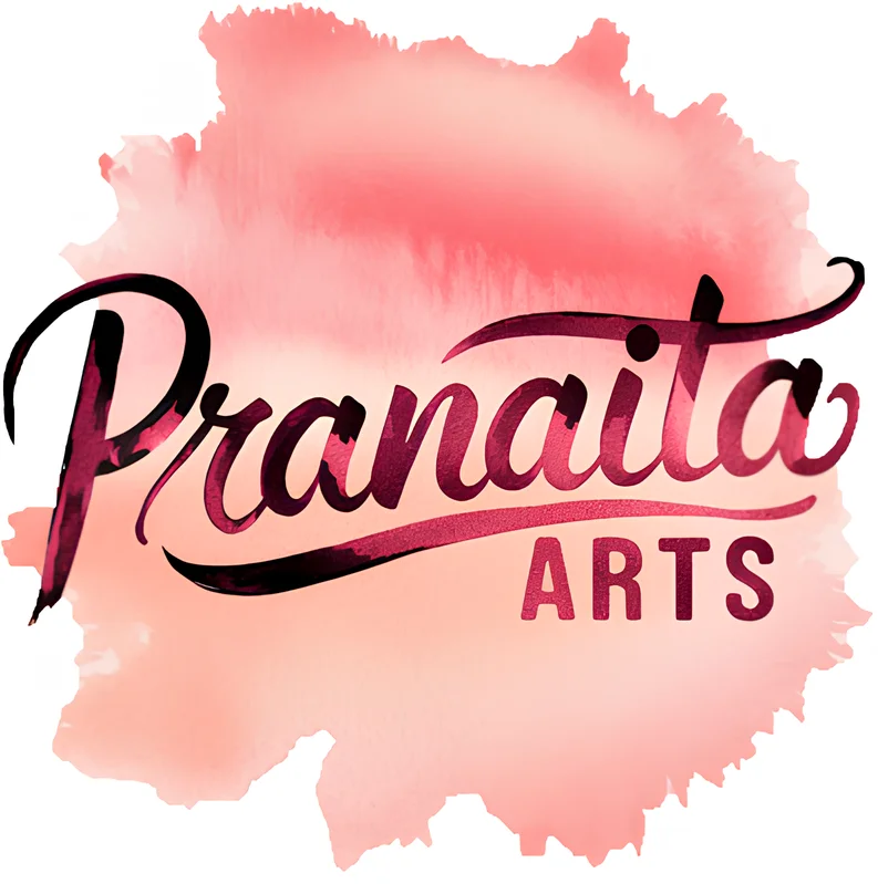
Pranaita Arts
The brief
An artist selling original, non-realistic paintings celebrating femininity needed an identity as expressive as the canvases themselves.
The concept
The artist's own hand becomes the mark — "Pranaita" flows in a brush script with a sweeping flourish, set on a watercolor wash so the logo itself feels painted, not typeset.
Why it works
Deep plum script over a blush watercolor wash mirrors the palette of the work. Expressive yet legible, it doubles as a website header, a print signature and a packaging stamp.
Full case study coming soon
How We Work
Brief to brand in four steps
A tight, transparent process — most identities ship in 2–4 weeks.
Brief
Week 1Understand your brand, audience, and competitors.
A 30-minute call and a short questionnaire — we dig into your audience, competitors and ambitions.
Concept
Week 1–2Present 3–5 distinct directions.
You get 3–5 genuinely different directions, each with the thinking behind it. No filler options.
Refine
Week 2–3Iterate on your chosen direction.
We sharpen your favourite — curves, spacing, color, type pairing — until it feels inevitable.
Deliver
Week 3–4Final files and usage guidelines.
SVG, PNG, PDF, favicon, social kit and a mini usage guide. Everything, organised, forever yours.
What You Get
Everything in the box
No "final_final_v3.jpg" handovers. A complete, organised identity kit.
FAQ
Asked before every project
Most identities ship in 2–4 weeks: brief and research in week one, concepts by week two, then refinement and final files. Need it faster? Tell us your deadline on the call and we'll confirm honestly whether it's doable.
Your Turn
The next mark on this page could be yours
Tell us about your business on a free 30-minute call. You'll leave with honest direction and a fixed quote — whether or not you hire us.
Typical reply time: under 2 hours on business days
A logo is step one — we build what comes next too
Website Design & Development
Custom business websites built for performance, conversions, and scalability — designed to turn visitors into paying customers.
Explore📱Mobile App Development
Native and cross-platform applications for iOS and Android — from MVP to App Store launch.
Explore🎨UI/UX Designing
User-centered interfaces designed to improve engagement and usability.
Explore