
Logo Redesign Case Study
Aaradhita Anugrah
From a template badge to a sacred mark — redesigning the identity of a premium event planning house, one meaningful curve at a time.
- Client
- Aaradhita Anugrah
- Industry
- Event Planning & Management
- Year
- 2025
- Scope
- Logo Redesign · Brand Identity
Client
Aaradhita Anugrah
Industry
Spirituality & Premium Brand
Year
2025
After replacing a generic template mark, the new identity shipped across event collateral with faster stakeholder sign-off and favicon-scale legibility.
Scope of Work
The Client
A house that builds celebrations
Aaradhita Anugrah plans and produces premium events across India — weddings designed around a couple's story, corporate events that carry a brand's weight, and birthday celebrations families talk about for years.
Their name is a promise in Sanskrit. Their logo, inherited from a quick template, said none of it. They came to us with one line:
“Make us look as premium as the events we deliver.”
आराधिता
Aaradhita
“The worshipped, the adored” — devotion made visible.
अनुग्रह
Anugrah
“Divine grace, a blessing” — the gift carried into every event.

The delivered primary lockup — mark, wordmark and blush canvas
The Starting Point
What the old logo was holding back
An honest audit before a single sketch. Six issues kept surfacing — each one quietly costing the brand recognition and trust.
Template DNA
A floral circle badge — the same frame used by thousands of boutiques. Nothing ownable, nothing protectable.
An ambiguous monogram
The script mark reads “Al”, “M” or “Att” before it ever reads “AA”. A logo you must decode is a logo you forget.
Hairline strokes
Delicate one-pixel lines vanish in print, embroidery and dark venues. The mark dissolves below 64px.
64px
32px
16px
By favicon size, the badge is already gone.
One pale gold
A single light tint with no contrast plan — washed out on white, invisible over the busy backdrops of real weddings.
No story
Nothing speaks to “Aaradhita” (worship) or “Anugrah” (grace). The same badge could sell candles or soap.
Tone mismatch
Crafty and homemade — while the company stages premium, large-scale productions. The logo undersold the work.
A lovely starting point — but nothing here belonged to this brand. A name this meaningful deserved a mark built with intent.
The Brief, Rebuilt
Five commitments for the redesign
Before drawing anything new, we agreed on what the new mark owed the brand. These became the test every sketch had to pass.
Meaning first
Every curve must earn its place by saying something true about the name — worship, grace, celebration.
Own a silhouette
Recognisable from the outline alone — across a banquet hall, on a moving van, at a glance.
Scale without fear
One mark that survives everything from a 16px favicon to a 40-foot wedding hoarding.
Premium warmth
Luxurious but never cold. This is a brand that celebrates — the mark had to glow, not gleam.
Rooted, not costumed
Indian at heart without leaning on clichés — no paisley stamps, no borrowed ornaments.
“If a shape can be removed without losing meaning, remove it.”
Step 1
Discover
Name etymology, rituals, competitor audit
Step 2
Sketch
40+ explorations around hands, flames, petals
Step 3
Refine
Geometry, optical balance, gradient tuning
Step 4
Deliver
Lockups, mono variants, QR & social system
The New Mark
One mark, five layers of meaning
Nothing here is decoration. Scroll through the story each shape is telling.
01
The hidden letter A
Strip everything back and the silhouette is one confident capital A — the first letter of both Aaradhita and Anugrah. A monogram that never has to announce itself.
One shape, two names
02
Hands joined in prayer
The two upward strokes meet like palms in Anjali Mudra — the Namaste that greets every guest at every event, and the literal meaning of Aaradhita: the one who is worshipped.
Devotion, made geometric
03
Leaves in full bloom
Beneath the hands, two leaves unfurl — Anugrah, the blessing. Growth, grace, and the fresh florals that dress every mandap and stage the team builds.
Grace you can see
04
The flame within
The space between the forms rises like a diya flame — the lamp lit at every auspicious beginning lives inside the mark, drawn entirely by what isn't there.
Negative space, doing the praying
05
Built to rise
Every line converges upward — an arrow of momentum. Each celebration elevated above the last; a brand permanently pointed at its next height.
Direction as a promise
01
The hidden letter A
Strip everything back and the silhouette is one confident capital A — the first letter of both Aaradhita and Anugrah. A monogram that never has to announce itself.
02
Hands joined in prayer
The two upward strokes meet like palms in Anjali Mudra — the Namaste that greets every guest at every event, and the literal meaning of Aaradhita: the one who is worshipped.
03
Leaves in full bloom
Beneath the hands, two leaves unfurl — Anugrah, the blessing. Growth, grace, and the fresh florals that dress every mandap and stage the team builds.
04
The flame within
The space between the forms rises like a diya flame — the lamp lit at every auspicious beginning lives inside the mark, drawn entirely by what isn't there.
05
Built to rise
Every line converges upward — an arrow of momentum. Each celebration elevated above the last; a brand permanently pointed at its next height.
Colour & Type
Drawn from the ceremony itself
No palette generator. Every colour is lifted from the world this brand works in — garlands, lamplight, sindoor and silk.
The lamplight gradient — the mark wears it top to tip, like a flame cooling into ember
The Wordmark
Three details most people feel,
few people notice
Wavy crossbars
The crossbars of the A and H ripple like a temple flag in breeze — one flourish that keeps the capitals from feeling corporate.
The Sanskrit tilde
A quiet diacritic curls under the U of ANUGRAH — a nod to the name's Devanagari roots, without wearing a costume.
Ceremonial spacing
Generous letter-spacing slows the wordmark to a processional pace. Premium brands never rush; neither does this one.
Custom-drawn capitals — not a font off the shelf
Before & After
Same name, new presence
Drag the handle. The difference isn't decoration — it's intent.
The redesign report card
Scored in our brand audit — before vs after, out of 10.
Distinctiveness
3 →9
Legibility at 16px
2 →9
Symbolic meaning
1 →10
Versatility
3 →9
Premium feel
4 →9
The shrink test
A logo lives most of its life small — avatars, favicons, app icons.
Old — dissolves
128px
64px
32px
16px
New — holds its shape
128px
64px
32px
16px
The new mark is pure geometry — it stays crisp from a hoarding all the way down to a 16px favicon.
The System in the Wild
An identity that travels
A logo is only as good as the hundredth place it shows up. Real deliverables from the system — not mockups.
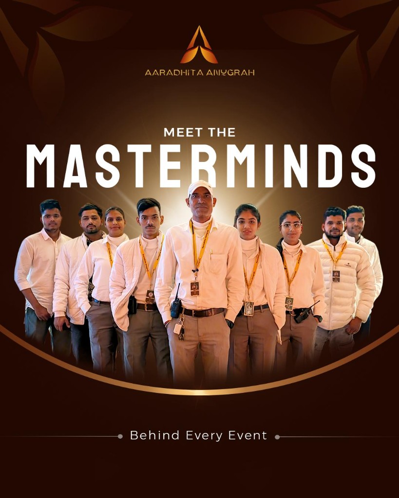
Social campaign creative
The mark crowns the team like an emblem — instantly theirs.
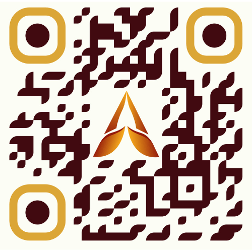
Even the QR code is on brand
Maroon modules, marigold finders, the mark at the centre — and it still scans first try.
App icon & favicons
Pure geometry stays sharp at 32, 24 — even 16px.
One-colour versions
For print, embroidery, engraving and foil — the mark never depends on its gradient to be recognised.
AARADHITA ANUGRAH
Backlit venue signage — the gradient reads as lamplight after dark
Team uniform patch
The mono mark embroiders cleanly — no hairlines to lose in thread.
Your Turn
Your logo should mean something.
We design identities with the story built in — marks your customers remember and your competitors can't copy. Tell us what your name means. We'll make it visible.
Free discovery call · Concepts in 7 days · Full identity system delivered
