Logo Identity — Case Study
RecycleRoot
A recycling identity that keeps the symbol everyone understands, then bends it into an ownable RR monogram for everyday consumer touchpoints.
- Client
- RecycleRoot
- Industry
- Recycling & Sustainability
- Year
- 2025
- Scope
- Logo · Identity · System
Client
RecycleRoot
Industry
Recycling & Sustainability
Year
2025
RecycleRoot received an ownable sustainability mark that keeps the universal recycling cue, clarifies the RR initials, and stays legible from app icons to bin labels.
Scope of Work
The Client
The recycling cue was familiar.
The brand still needed ownership.
RecycleRoot needed to feel approachable enough for households and sharp enough for a service people can trust with daily recycling habits.
The challenge was to avoid generic eco clip-art while preserving the instant recognition of three arrows. The solution makes the initials do the work: two R forms become the loop itself.
The Ask
“Keep recycling instantly recognizable, but make the symbol ours.”
Logo Anatomy
Familiar enough to understand, distinct enough to remember
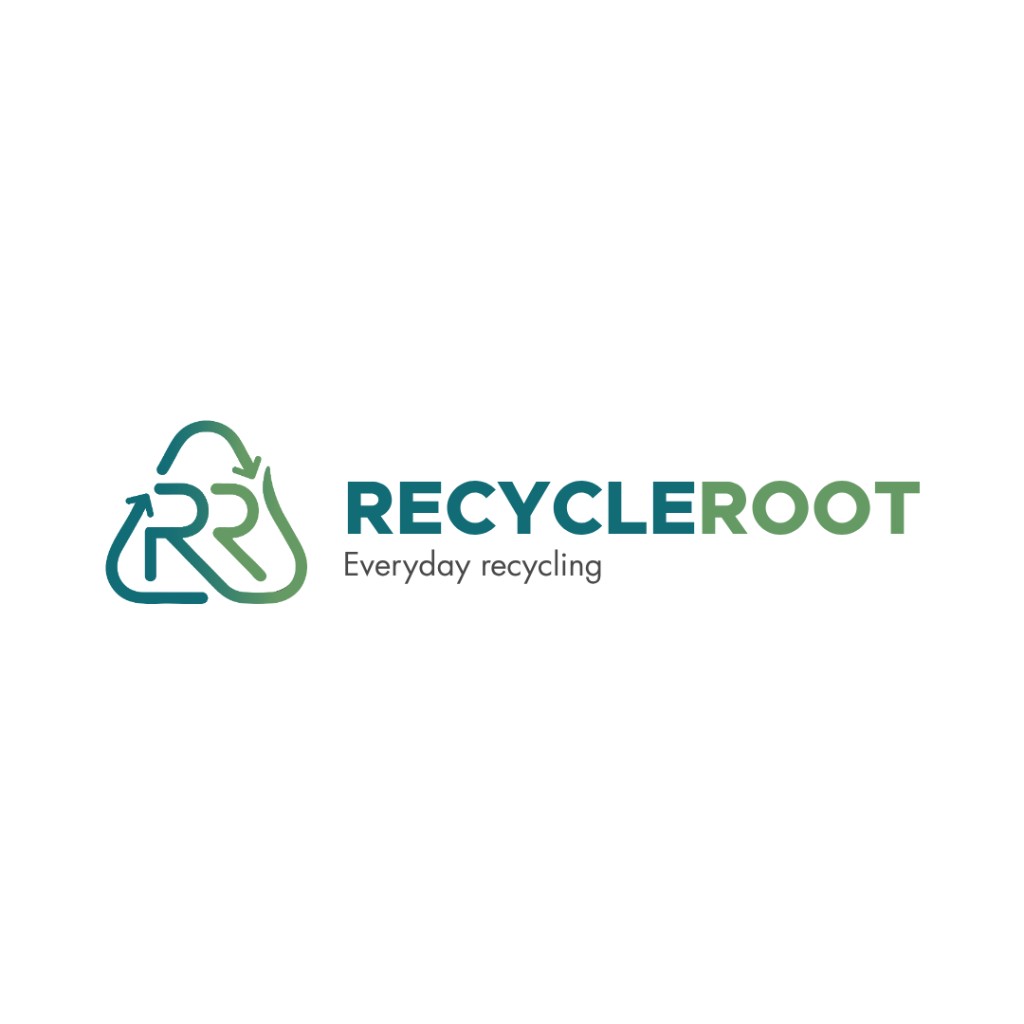
The mark balances instant category recognition with an ownable RR structure for RecycleRoot.
Two R's, one loop
Recycle and Root both start with R, so the logo lets the initials form the recycling path instead of sitting beside a generic icon.
The arrows complete the promise
The arrowheads keep the universal recycling cue intact: collect, sort and renew remain readable before the viewer even notices the monogram.
Rounded strokes feel everyday
Soft corners make the brand approachable for households, labels and community education rather than industrial or punitive.
Triangle memory, custom silhouette
The outer motion borrows the memory of the recycling triangle, while the inner RR geometry gives RecycleRoot a shape it can own.
Two R's, one loop
Recycle and Root both start with R, so the logo lets the initials form the recycling path instead of sitting beside a generic icon.
The arrows complete the promise
The arrowheads keep the universal recycling cue intact: collect, sort and renew remain readable before the viewer even notices the monogram.
Rounded strokes feel everyday
Soft corners make the brand approachable for households, labels and community education rather than industrial or punitive.
Triangle memory, custom silhouette
The outer motion borrows the memory of the recycling triangle, while the inner RR geometry gives RecycleRoot a shape it can own.
Color & Type
A gradient that separates recycle from root
The palette moves from civic teal to living green, echoing the name and keeping the identity fresh on white, dark and field materials.
Recycle → Root
Everyday recycling
Friendly sans-serif, no eco cliché
Bold enough for bins
The uppercase wordmark reads clearly on labels, collection points and posters where people only glance for a second.
Soft enough for households
Rounded forms and open spacing keep the identity approachable instead of industrial.
The tagline grounds the promise
Everyday recycling makes the mission practical: not a campaign, a habit people can repeat.
Applications
Built for the places eco brands actually show up
RecycleRoot needed to survive small, repeated and public-facing use: avatars, stickers, bins, signs and quick education moments.
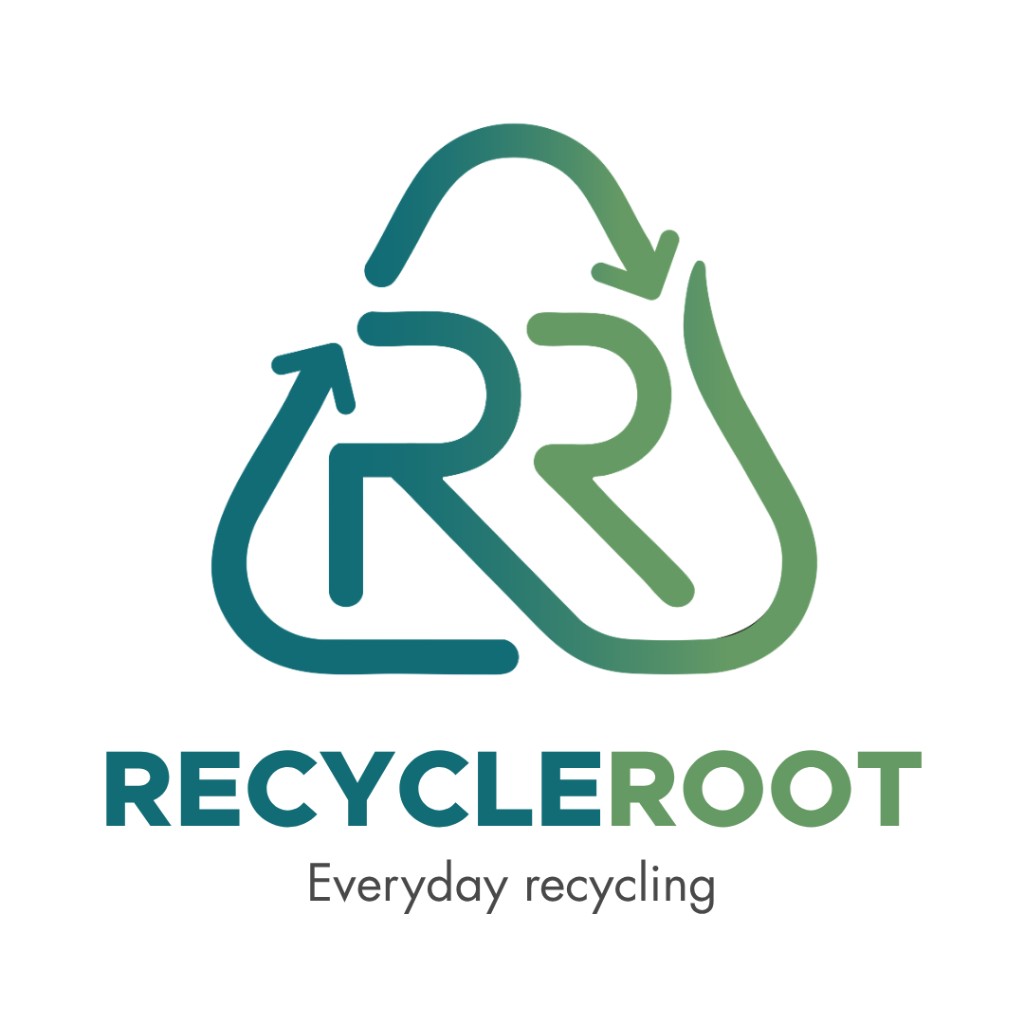
Horizontal lockup
Website headers, invoices, posters and community materials.
Square avatar
Social profiles, app icons, QR inserts and WhatsApp display pictures.
Bin Label
The continuous-line mark stays recognizable on collection bins and sorting labels where contrast and distance matter.
Sticker System
Paper
Metal
Plastic
E-waste
Scale Test
96px
64px
40px
24px
The RR shape was selected to remain identifiable even when the tagline drops away.
Your Turn
Need a logo people understand and remember?
RecycleRoot turns a familiar category symbol into an ownable brand. We can do the same for your business: strategy, identity and launch-ready assets designed as one system.
Free discovery call · Logo and identity systems · Launch-ready files