
Website Design Case Study
KabadCart
A doorstep scrap-pickup startup that needed its website to feel like a fintech app, not a junkyard. Here's how we designed, built, and launched kabadcart.com — a site that turns "too much scrap" into a scheduled pickup in three taps.
- Client
- KabadCart
- Industry
- Recycling & Waste Management
- Year
- 2025
- Scope
- Design · Development · SEO
Client
KabadCart
Industry
Recycling & Waste Management
Year
2025
Location
Jaipur, Rajasthan
Selling scrap in India usually means phone calls, haggling, and waiting around. KabadCart flips that — schedule a pickup like you'd order groceries, get weighed fairly, and get paid on the spot. The website's one job: make that feel obvious in five seconds.
Scope of Work
Our Strategy
Sell the pickup, not the website
Before a single pixel was drawn, we agreed on three principles that shaped every section of kabadcart.com.
App-first funnel
The website isn't the product — the app is. Every scroll path ends at a Play Store badge, an App Store badge, or the pickup form. The site's job is to warm up a stranger and hand them to the app already convinced.
Trust through transparency
A cash-for-scrap business lives or dies on fair rates. So we put live scrap prices, the weighing process, and 'no haggling, no middlemen' promises front and centre — the exact objections a first-time visitor arrives with.
Built to expand
KabadCart launched in Jaipur with Jodhpur, Ajmer, Kota, and Udaipur next. The site structure — city pages, partner funnels, service tabs — was designed so each new city is a content update, not a redesign.
Five weeks, brief to live
Discovery & Funnel Mapping
Week 1- Interviewed the founders on how pickups actually happen
- Mapped two audiences: households selling scrap, partners buying it
- Competitor scan — most scrap sites looked like directories, not products
UX & Visual Design
Week 2–3- Wireframed the five-second hero: pain, promise, two CTAs
- Extended the brand's Recycle Green palette into a full UI system
- Designed the how-it-works flow to mirror the app's onboarding
Development & SEO
Week 3–4- Built with Next.js — server-rendered pages for instant first paint
- Local SEO groundwork: city keywords, structured data, meta system
- Scroll-reveal and micro-animations tuned for budget Android phones
Launch & Optimise
Week 5- Performance pass — 93 Lighthouse on mobile, zero layout shift
- App-store deep links and WhatsApp handoffs wired to analytics
- Handover with a content playbook for new cities and rate updates
Design Decisions
Every section earns its place
The reasoning behind the four sections that do the heaviest lifting on kabadcart.com — captured from the live site.
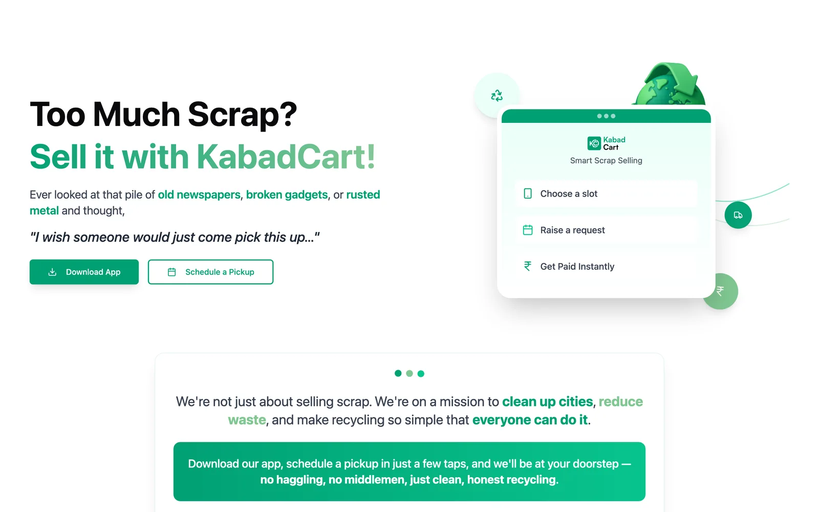
Why does the hero sell in five seconds?
Name the pain, show the fix
“Too Much Scrap? Sell it with KabadCart!” isn't clever copy — it's the exact thought a visitor arrives with. Next to it, a floating app card walks through the three-step product before they've scrolled a pixel.
- Two CTAs split intent: app users tap Download, everyone else taps Schedule a Pickup
- The app mockup card doubles as a product demo — no explainer video needed
- Highlighted keywords (old newspapers, broken gadgets, rusted metal) mirror real search queries
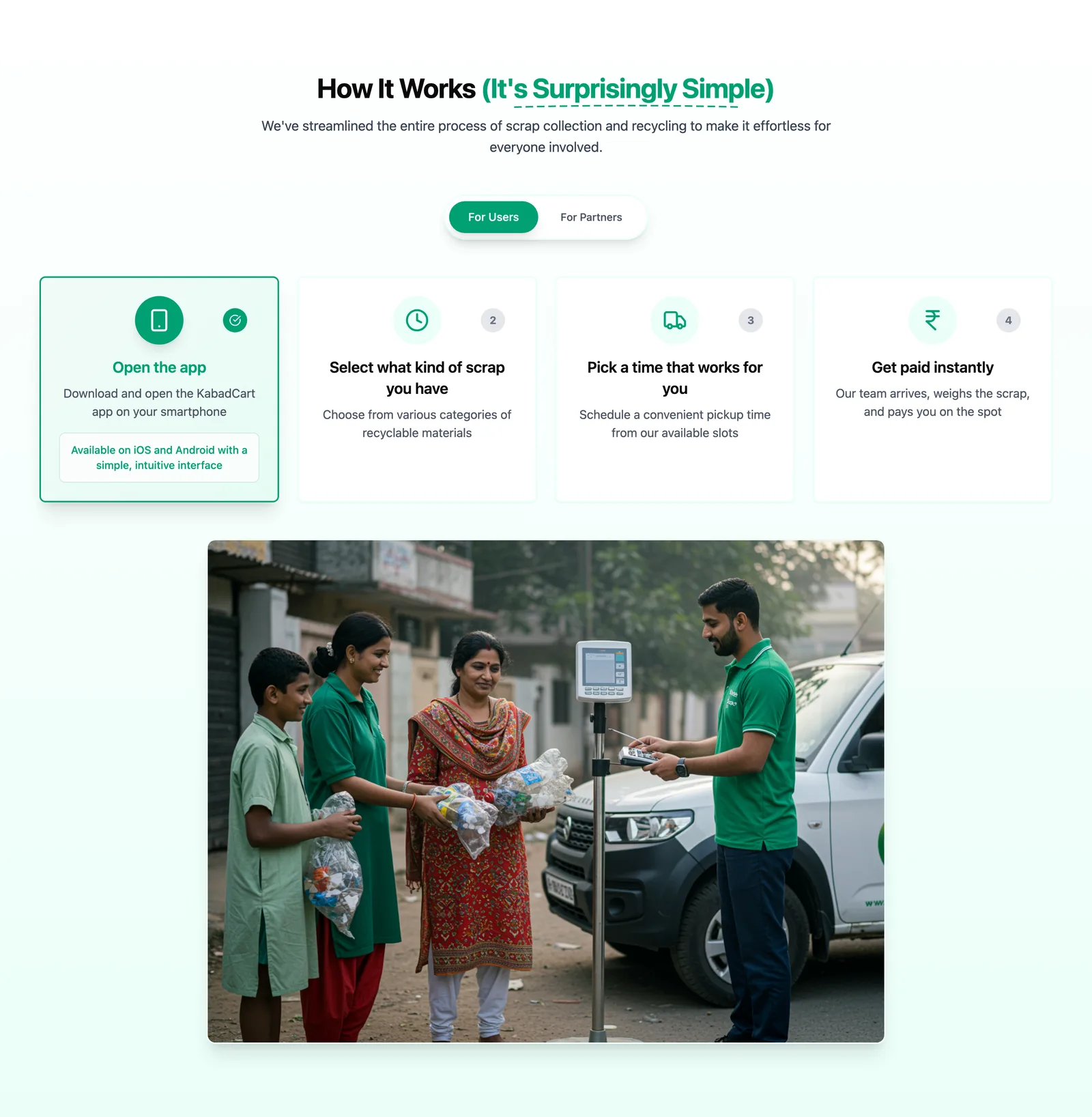
Why does how-it-works read like app onboarding?
Four numbered cards, zero friction
Every visitor eventually lands in the app, so the website teaches the same flow the app does: open, select scrap, pick a slot, get paid. Familiarity on the site becomes confidence in the app.
- Users / Partners tabs serve both audiences without splitting the page
- Numbered steps set the expectation that this takes minutes, not phone calls
- Real pickup photography — a weighing scale on a street, not stock imagery
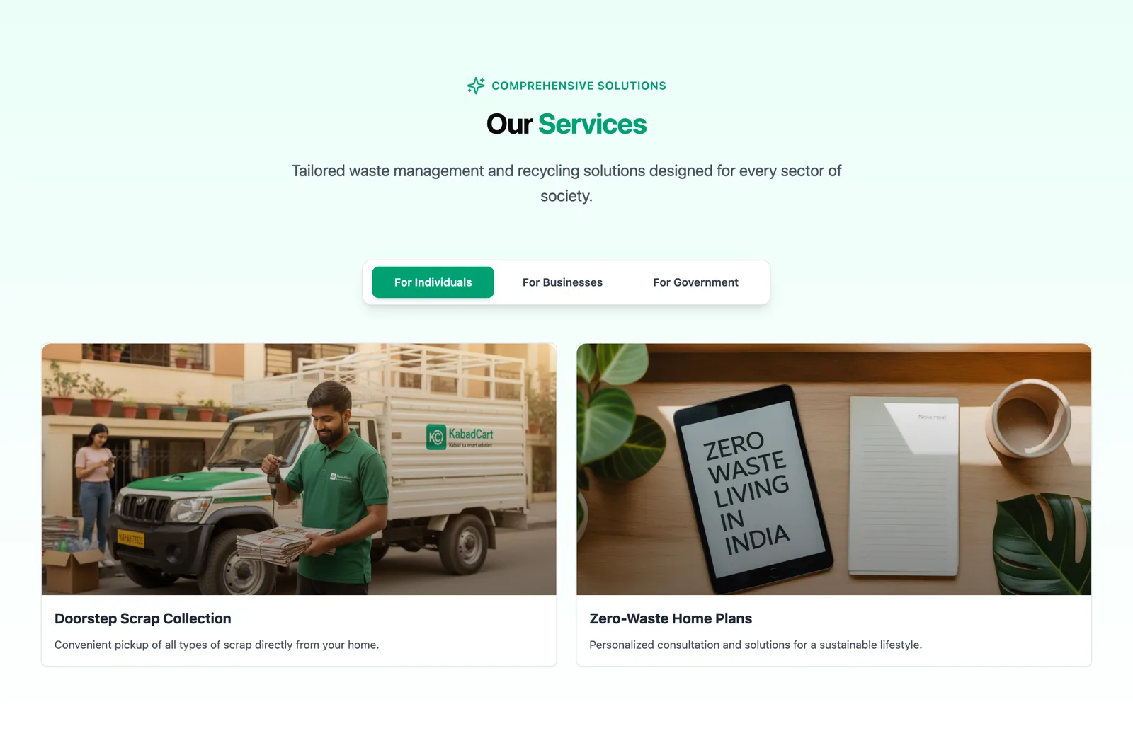
Why tabs for individuals, businesses, and government?
One service section, three audiences
KabadCart sells doorstep pickup to households, zero-waste programs to companies, and smart-waste partnerships to municipalities. Tabs keep the page short while letting each audience find their own pitch in one click.
- Households see convenience; businesses see compliance; government sees infrastructure
- Each tab keeps its own imagery and copy tone — no generic catch-all cards
- The section stays compact, protecting the page's scroll rhythm and whitespace
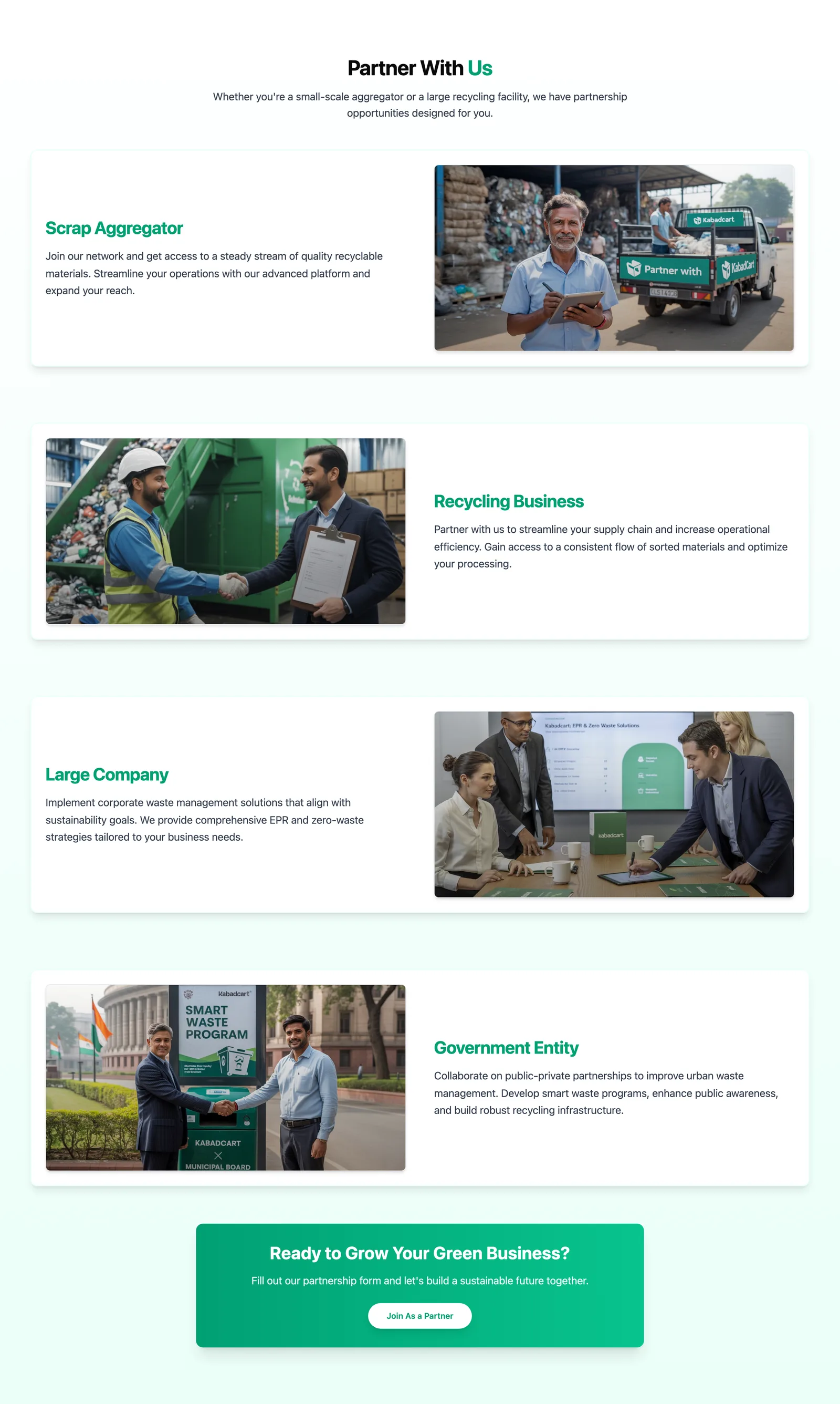
Why four separate partner funnels?
B2B growth, designed in from day one
Expansion across Rajasthan needs aggregators, recyclers, corporates, and government bodies. Each persona gets its own card, its own value proposition, and the same 'Join as a Partner' endpoint — a B2B pipeline disguised as a landing section.
- Alternating image-text rows keep a long section scannable
- Concrete personas beat a vague 'partner with us' — people self-select
- One shared form endpoint keeps lead routing simple for a lean team
Motion With a Job
Why we animated it — and how it looks live
Every animation on kabadcart.com either guides the eye or confirms an action — nothing moves just to move. These clips are recorded straight from the live site.
The hero entrance
Elements stagger in — headline, keywords, CTAs, then the app card — so a first-time visitor's eye is walked from the pain to the fix to the button. Motion ends exactly where we want the click.
Tabs, not page loads
Switching between For Users and For Partners swaps content instantly with a soft transition. No navigation, no waiting — the page answers both audiences without ever losing scroll position.
Scroll-triggered reveals
Sections fade and lift in as you scroll, keeping a long single-page site feeling alive. Each reveal is subtle and fast — it rewards scrolling without ever blocking reading.
All animations respect the visitor's reduced-motion preference — the site stays fully usable with motion switched off.
The Design
The whole site, panning below
Desktop and mobile, top to bottom — hover to pause and take a closer look.


Key Features
- Rate check, pickup CTA, and app badges above the fold
- Pickup scheduling explained in three taps — like app onboarding
- Transparent scrap rate cards for every material
- City expansion pages — Jaipur live, four more Rajasthan cities queued
- Partner funnels from aggregators to government bodies
- WhatsApp and app-store deep links on every key section
The Stack
What we built it with — and why
Every technology choice traces back to the same three needs: fast on cheap phones, findable on Google, and easy for a small team to grow.
Next.js
Framework
Pages are server-rendered and arrive as ready HTML, so both Google and a visitor on a slow connection get content instantly. The routing structure scales cleanly to city pages as KabadCart expands across Rajasthan.
Tailwind CSS
Styling
The brand's Recycle Green palette, spacing, and type scale live as design tokens. Every new section stays visually consistent by default, and the shipped CSS stays tiny because unused styles never leave the build.
CSS-first animation
Motion
Entrances, tab transitions, and scroll reveals run as GPU-composited CSS animations rather than heavy JavaScript. That keeps 60fps motion on the budget Android phones most of KabadCart's audience actually uses.
Vercel
Hosting
Global edge network puts the site physically close to every visitor, deploys go live in seconds, and there's no server for a lean startup team to babysit. Rate updates ship as fast as they're written.
The Results
What changed after launch
A conversion-first design only counts if the numbers move. They did.
0×
pickup form starts
Within 60 days of launch, visitors starting the pickup flow more than doubled.
0
Lighthouse performance
Measured on the live site, on mobile — first paint in 1.1s, zero layout shift.
0
Lighthouse SEO score
Clean structure, metadata, and crawlability — ready to rank for 'sell scrap online' searches.
0 wks
from brief to launch
Strategy, design, development, and SEO — shipped live in five weeks flat.
We told Aucio we wanted selling scrap to feel like ordering groceries. They got it on the first call. The site explains KabadCart better than we do — people land, check the rates, and book a pickup without a single phone call. Pickup requests kept climbing every week after launch.
Let's Build Together
Want a website that turns visitors into customers?
Whether you're a startup, a local business, or scaling across cities — we design and build websites with one job: making people act. KabadCart's took five weeks.