Quick answer
What conversion rate should a SaaS landing page have?
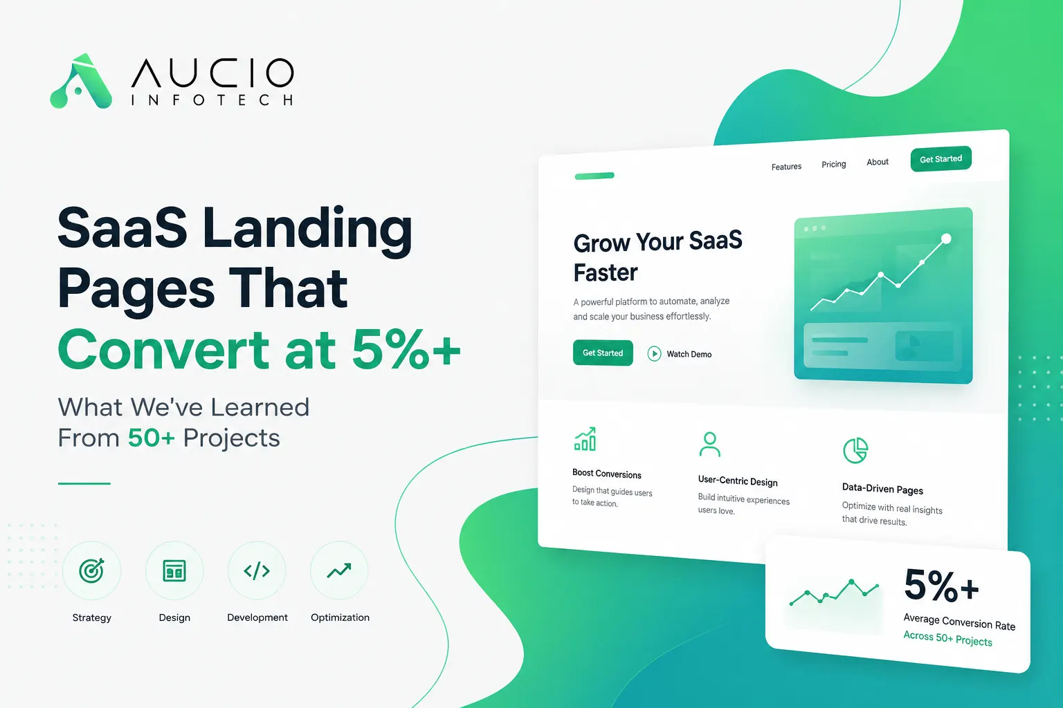
The average SaaS landing page converts at 1-2%. At Aucio Infotech, our best-performing pages for clients consistently hit 4-5%+ by following the patterns in this guide.
- Average SaaS Landing Page
- 1-2%
- Industry average conversion rate
- Aucio Infotech Clients
- 4-5%+
- Top-performing pages we've built
- Projects Delivered
- 50+
- Landing pages across fintech, healthcare, logistics
- Delivery Time
- 4-6 weeks
- From kickoff to live site
The average SaaS landing page converts at 1–2%. That means for every 100 visitors who land on your page, 98 or 99 leave without doing anything.
We've built landing pages for SaaS companies across fintech, healthcare, and logistics. The ones that perform — consistently hitting 4–5%+ conversion — share a few patterns. None of them are complicated. Most of them are boring. All of them work.
Key takeaways
- One message, one CTA — multiple CTAs split attention and kill conversions
- Specific social proof beats generic 'trusted by thousands' claims
- Show pricing savings as actual rupees, not percentages
- Mobile-first is non-negotiable for Indian SaaS audiences
- Outcome-oriented CTAs outperform generic 'Get Started' buttons
Here's what we've learned from building 50+ landing pages at our Jaipur-based agency.
Above the Fold: One Message, One CTA#
The single biggest mistake we see: the hero section tries to say too much.
You have about 3 seconds before a visitor decides whether to scroll or bounce. If your headline is clever but unclear, or if there are three competing CTAs, you've lost them.
The best-performing pages we've built follow a simple formula:
- Headline: What your product does, in plain language. Not "Revolutionize your workflow with AI-powered synergies." Try: "Automate your invoice follow-ups. Get paid 2x faster."
- Subheadline (optional): Who it's for or why it matters. "Used by 200+ Indian logistics companies."
- One CTA: One button. Not "Start Free Trial" next to "Book a Demo" next to "Watch Video." Pick the single action that matters most and make it the only thing to click.
And no, adding a second CTA doesn't double conversions. It splits attention and kills both.
Social Proof That Actually Works#
"Trusted by 10,000+ companies" means nothing. Everyone says that.
The social proof that moves conversion rates looks different:
- Specific numbers. Not "thousands of users" but "1,247 active teams." Not "fast" but "pages load in 1.2 seconds." Vagueness reads as made-up. Specificity reads as honest.
- Named logos. If actual companies use your product, show their logos — with permission. A row of 5 recognizable names does more than a paragraph of testimonials.
- Video testimonials > text testimonials. Text quotes are fine. A 45-second phone video of an actual customer saying "this saved us ₹3 lakh in dev costs" is 10x more convincing. We're wired to trust faces and voices.
- Objection-handling proof. If prospects consistently worry about security, show your SOC 2 badge. If they worry about setup time, quote a customer who went live in 2 days. Don't just list features — use proof to kill objections.
Pricing Page Psychology#
Most SaaS pricing pages are designed to push people toward the middle tier. That's fine. But the pages that convert best do two additional things:
- Show the annual discount as actual rupees saved, not a percentage. "₹24,000/year (save ₹8,000)" lands harder than "20% off annually."
- Answer the "what if I don't like it?" question before it's asked. A money-back guarantee, a free cancellation window, a no-questions-asked refund policy. If you're confident in your product, put a risk-reversal statement next to every CTA button.
One client we worked with added "Cancel anytime, no questions asked. We'll even help you export your data." next to their signup button. Conversions went up 18%. That one line.
Mobile-First for Indian Audiences#
If you're selling SaaS to Indian businesses, your mobile landing page matters more than your desktop one. Here's why: a significant chunk of your traffic — often 60%+ depending on the industry — is coming from phones. Decision-makers in Indian SMEs and startups are researching tools on their phone, between meetings, on WhatsApp.
A few things that kill mobile conversions:
- Forms with more than 3 fields. Every extra field drops completion rates by 10-15%.
- CTAs that require scrolling to find. Put one in the first screen, not below a wall of text.
- Auto-playing videos that eat mobile data. Use static images with a play button instead.
- Tiny tap targets. Buttons should be at least 48×48 pixels, with comfortable spacing.
Test your landing page on a ₹8,000 Android phone on a patchy 4G connection. If it loads in under 2 seconds and the CTA is thumb-reachable, you're in good shape.
The CTA That Actually Works#
We see a lot of "Get Started" and "Learn More" buttons. They're fine. But after testing across 50+ projects, the CTAs that perform best are outcome-oriented:
- "Book a Free Strategy Call" (what we use)
- "Get Your First 100 Users"
- "See How Much You'll Save"
- "Start Your Free Trial"
The pattern: the button tells you what will happen after you click it, not what the button is called. "Get Started" is a label. "Get Your First 100 Users" is a promise.
Here's the thing about landing pages: the difference between 1% and 5% conversion isn't some design secret. It's discipline. One message. One CTA. Real proof. Fast load times. No clever gimmicks.
SaaS Landing Page Benchmarks#
| Metric | Industry Average | Aucio Infotech Clients | Top Performers |
|---|---|---|---|
| Conversion Rate | 1-2% | 3-4% | 5%+ |
| Page Load Time | 3-4s | 1.5-2s | <1.5s |
| Bounce Rate | 65-80% | 45-55% | <40% |
| Mobile Traffic Share | 40-50% | 55-65% | 60%+ |
| Form Abandonment | 70% | 50-55% | <45% |
Frequently Asked Questions#
How much does a SaaS landing page cost in India?
What is a good conversion rate for a SaaS landing page?
How long does it take to build a SaaS landing page?
Do you build the full SaaS product or just the landing page?
What makes Aucio Infotech different from other SaaS web design agencies?
Get a free landing page audit →
Get a free landing page audit →